Apps
Updates to other built-in apps in iOS 11 are mostly iterative in nature. With the exception of Podcasts (which follows the stylistic guidelines of Apple Music in iOS 10), iOS 11’s app roster has prioritized functional tweaks and refinements over full-blown redesigns.
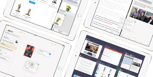
Messages
I’m not sure the iMessage App Store turned out to be the massive success Apple was expecting. iMessage apps and games aren’t going to overtake traditional titles in terms of mindset, and iMessage revenue has barely registered on many developers’ financial reports. Still, the iMessage App Store created an avenue for thousands of creative professionals to express their art and experiment with fascinating concepts and business models – that’s something worth continuing to invest in. With iOS 11, Apple is fixing the most controversial aspects of iMessage’s app experience.
Developers of iMessage games and other fast-paced apps can now use a Direct Send API to send a rich message bubble without inserting the message in the compose field first. Now, an iMessage game can send a message after you complete your move instead of just preparing the message in the compose box.
Playing games with Direct Send-enabled iMessage apps should feel faster than before, but developers can’t abuse the feature. Apple thinks that the majority of iMessage apps should still use the regular Insert API, which allows users to verify a message, attach a text comment, or send it with an effect. Only one message can be delivered with Direct Send per user interaction with the app; iMessage apps that use the Direct Send API won’t be able to spam the recipient with dozens of automated messages. I expect multiplayer iMessage games to strongly benefit from these updates.
Apple is also getting rid of iOS 10’s nonsensical iMessage app picker after spending some time to understand how normal people use iMessage.

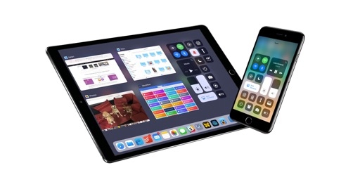
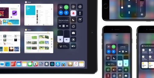
The iMessage app picker is now a strip of apps and sticker packs docked at the bottom of the screen and immediately displayed when you open a conversation. The picker is divided in two sections: favorites on the left, and other apps and sticker packs on the right.
When you open a thread, you can tap on an app’s icon to interact with it in compact mode without having to waste time scrolling to find the sticker you’re looking for. You only need to scroll the picker to view more apps or rearrange them with drag and drop.

You have complete control over favorites and other apps in the picker. To edit which apps appear in it, scroll to the rightmost edge and tap the More button; you’ll open a screen where you can hide installed iMessage apps you don’t want, add some to your favorites, and tweak the placement of others. By default, iOS 11 automatically enables an iMessage app or sticker pack after it’s downloaded from the App Store, pinning it as the first item in the More Apps section of the picker with a blue dot. This should alleviate the confusion caused by downloading an iMessage app from the App Store without knowing where it ended up.
The new iMessage app picker gets nearly everything right. It’s persistent, compact but expandable, it supports favorites, and it has a reasonable way of dealing with newly installed apps. It also lets you disable Digital Touch (unsurprisingly, no longer in a premium spot next to the compose box) and reorder every app to match your usage of iMessage. I still would like the picker to be clustered between the compose box and QuickType suggestions when the keyboard is shown, but this is enough for now. I’m going to use stickers a lot more in iOS 11.
Along with improvements to apps, Apple has launched a new extension type for developers that want to integrate with Messages (not iMessage). Following call blocking extensions in iOS 10, iOS 11 is gaining SMS filtering extensions (based on the Identity Lookup API) to analyze sender and content information of SMS and MMS, identify bad actors, and filter them out in the Unknown & Junk section of the app.
As with spam callers, Apple must have realized that SMS spam is a regional problem that requires a serious commitment and ongoing work to keep an updated list of junk senders and message types across the world. It’s much better for Apple to offload this kind of work to third-party companies that specialize in this field.

SMS filtering extensions can allow (whitelist) or filter (blacklist) messages from unknown senders only, and they operate locally on-device32. Identity Lookup cannot work with senders in the user’s Contacts or with iMessage messages from any source. SMS or MMS marked as potential junk are filtered: they don’t display a notification, they don’t play any sounds when they come in, and they’re held in a quarantine zone of Messages. Only one filtering extension can be enabled at a time, and iOS knows when to override the filter and promote a junk thread to non-junk: after multiple responses are sent in the thread, it‘ll be moved back into the main conversation list.
After the solid results of call blocking extensions on iOS 10 (my annoyance with spam calls has grown substantially smaller, and I’m not alone), I’ve had a good experience with the Identity Lookup extensions I’ve tested on iOS 11 too. One of them, MessageFilter, lets me create whitelist and blacklist rules for keywords or phone numbers that match the sender or content of an incoming SMS; another one, SMS Shield, uses machine learning (via Core ML) to automatically determine potential spam messages and filter them.
Thanks to SMS filtering extensions, I haven’t seen spam messages from my local supermarket (or other stores that unfortunately have my phone number) in months because they’ve been automatically hidden. Although spam SMS messages are less of a nuisance than spam calls, Identity Lookup is a welcome addition to Messages.
Finally, Apple has brought two new full-screen effects to iMessage. While I was somewhat skeptical of effects last year, I’ve kept using them as an over-the-top, sometimes sarcastic way to express my feelings with close friends. The new entries in iOS 11 – Echo and Spotlight – are poised to become new favorites among heavy iMessage users.
The Echo effect is the perfect feature to pester friends, with hundreds of clones of the same emoji or selfie taking over the conversation. Go crazy with it.
There are other major features coming to iMessage, but I wasn’t able to test them yet.
Peer-to-peer payments with Apple Pay are coming later this year as an iMessage app. This is a terrific idea and it marks the beginning of Apple as a virtual bank for its users, but it’s going to be limited to the United States initially. On the other hand, Business Chat – a way for local shops and online businesses to communicate with customers on iMessage through a custom UI and messaging features – is only available as a developer preview, but won’t be launching publicly until next year.
During the iOS 11 beta stage this summer, Apple also tried to put an end to the problem of Messages carrying different threads across multiple devices by introducing iCloud sync for the app. The company later decided to delay Messages in iCloud to a future update to iOS 11 – a wise decision to ensure this functionality will scale for millions of users with billions of messages to sync between devices.
Messages in iOS 11 remedies most of the mistakes with last year’s iMessage App Store. It’s not another dramatic reinvention, but a much needed optimization, with more on the way in the coming months.
Podcasts

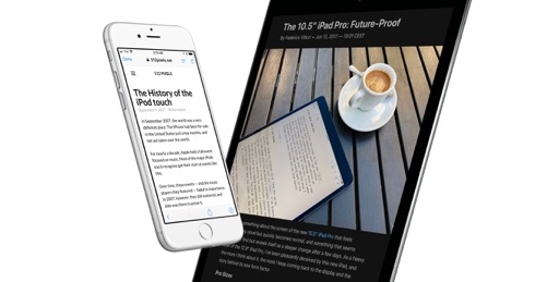
After hitting the remarkable milestone of 400,000 podcasts available on iTunes, Apple decided to switch things up with their official Podcasts app for iOS.
In a not-so-shocking move following the rebranding to Apple Podcasts33, Podcasts for iOS 11 has adopted iOS 10’s Apple Music design wholesale. The entire app has received a fresh coat of paint: large titles are used in main navigation views, with decreasing sizes for subtitles and labels in sub-sections and nested views; from circular buttons and contextual menus to the bottom player and Now Playing screen, Podcasts now looks like a sister app to Apple Music, only optimized for spoken content rather than songs.
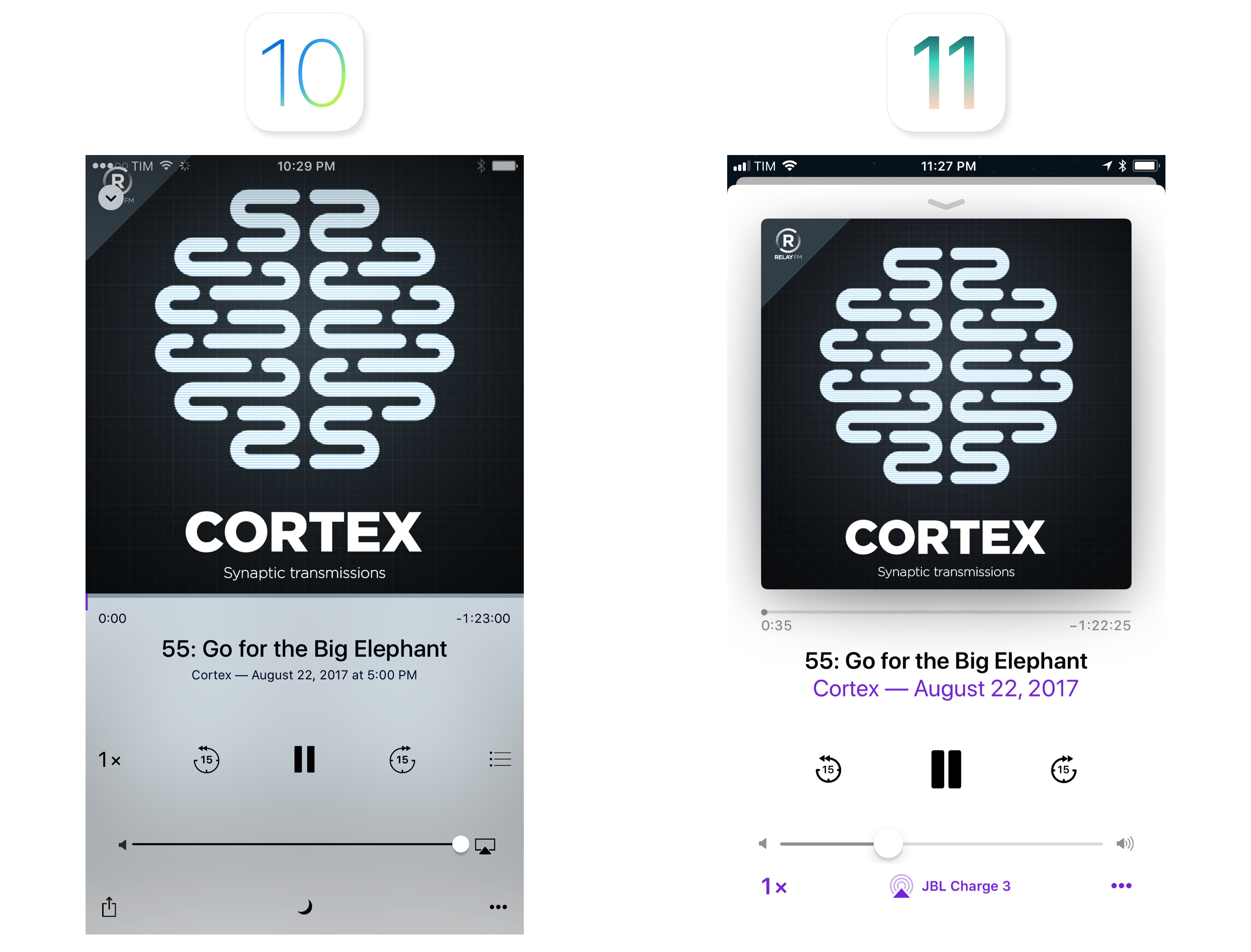
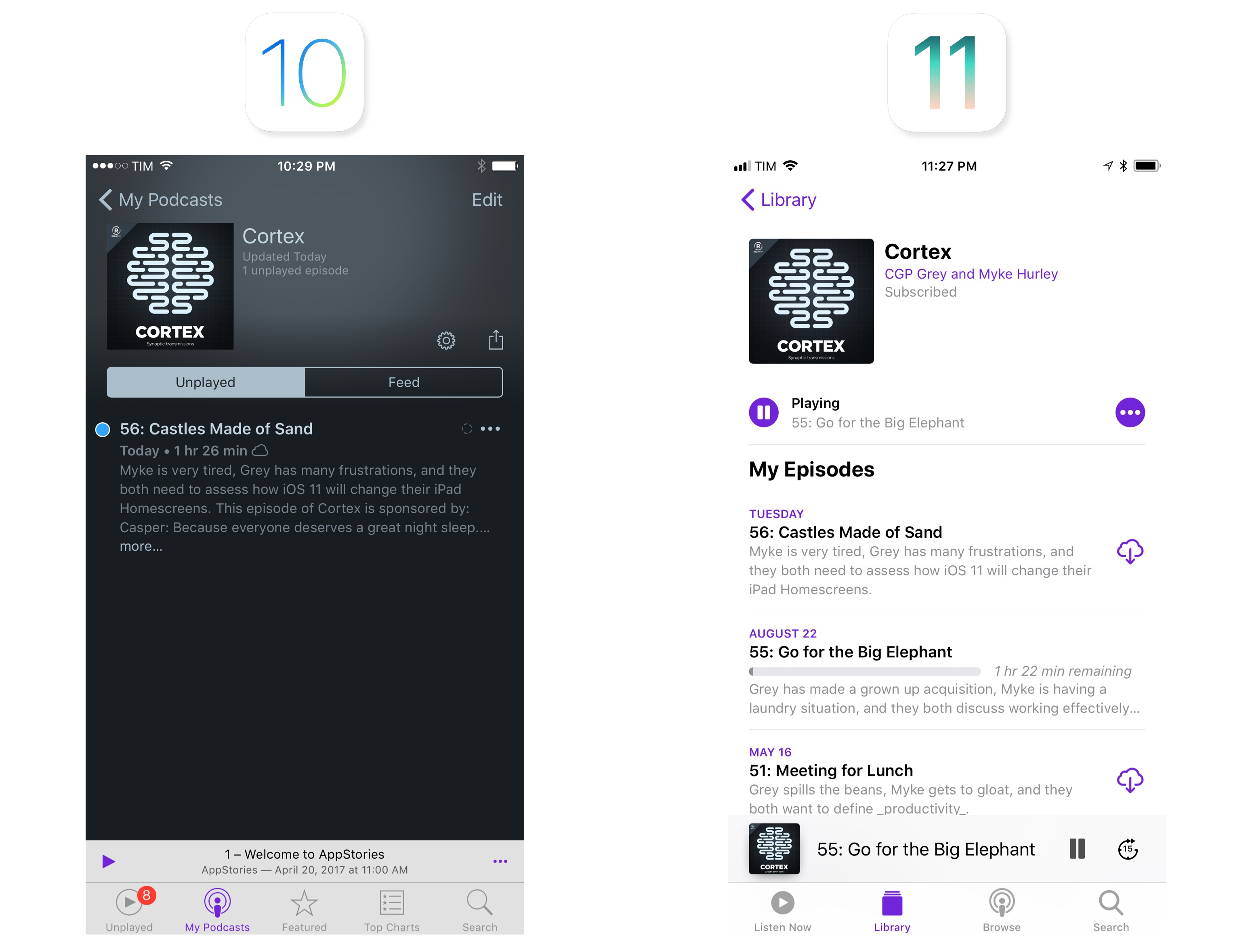
The new design is a great fit for Podcasts. As with Music last year, every view in the app is deferential to artwork and, in this case, episode titles and playback controls. Individual show pages, for instance, shed the iOS 7-era color-matched background in favor of a predominantly black and white design where the Play button and available episodes stand out more.
The same is true for Now Playing: the screen is accessed by a larger, Music-like playing bar at the bottom; the view itself is an exact replica of Apple Music. You can even swipe up to reveal episode descriptions, a sleep timer, share features, and your Up Next queue like you would for similar features and lyrics in Apple Music.

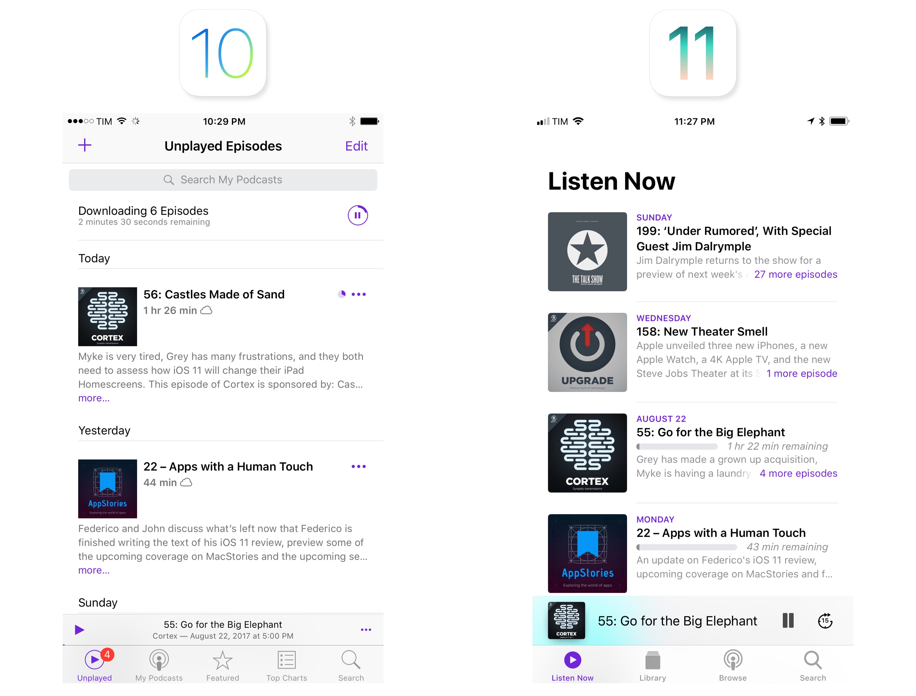
Simplicity and glanceable information have reshaped the app’s usability. The main Unplayed page has been renamed to Listen Now, and it’s been split into three sub-sections: unplayed episodes; podcast recommendations based on what listeners with similar interests like; and episodes you’ve recently played.
Absent a way to generate personalized playlists of episodes based on a user’s taste and daily routine, Apple turned Podcasts’ main page into a mix of lightweight discovery and shortcuts to start listening to episodes quickly. The recommendations aren’t as eerily accurate as the intelligent mixes of Apple Music, but the Listeners Also Like section often brought to my attention shows outside my typical sphere of networks and podcasters I follow, which I appreciated.
There are other smarts in the app: each show features a Best of the Podcast section where you can find the most popular episodes among recent ones – useful to get the feel of a show before subscribing to it. Recommendations for other podcasts are also displayed at the very end of an individual show’s page.

I’m a fan of the new Listen Now queue. I find myself often resuming and starting new episodes from this page. With 3D Touch, it only takes a couple of seconds to play another episode, save it offline, or add it to the global Up Next queue. I also like that episodes from shows you don’t subscribe to can be added to Listen Now; this is great for the occasional episode you’re interested in. Even though Listen Now doesn’t offer the fine-grained control of the triage system seen in Castro34, the cleaner presentation is a definite improvement over iOS 10.
I’m not sure what purpose the Recently Played section of the Listen Now page is supposed to serve. It feels like a case of blindly copying what another team built: unlike music, podcast episodes aren’t something you repeatedly listen to. I struggle to see the benefit of giving up screen real estate for older episodes you’re already done with. If the Podcasts team wanted to implement another feature from Music, they should have considered social sharing with user profiles: seeing what my friends are listening to now is something that would scale well to podcasts too.
Beyond the redesign, Apple has introduced changes to the podcast RSS spec that are going to be reflected in the app. Episode numbers are a new tag in a podcast’s RSS feed, which will allow creators to omit hardcoded numbers in episode titles as they will be automatically added by Podcasts. In addition, Apple has created tags for special types of episodes: trailer and bonus. These episode types are perfect for new shows or as extras, and they’re also visualized outside of the main feed of episodes in the app.
More importantly, Podcasts now supports episodic and serialized shows. Episodic is the traditional podcast structure: you subscribe to a show and receive new episodes on a regular basis. With a serialized show, however, the creator can split the podcast in seasons, like a TV show; a season can group multiple related episodes together, which makes it easier for podcasters to thematically tie episodes and for users to download them in bulk from the app. Even better, episodes from serialized shows will follow the correct sequence in the Listen Now page, starting with the oldest episode first rather than the newest.

I’ve only come across a couple of shows with seasons; future shows inspired by S-Town and Serial will likely take advantage of them for their storytelling formats. The best part of these spec changes is that they’re not exclusive to Apple’s Podcasts app: thanks to the open nature of RSS, developers of third-party podcast clients can choose to adopt everything Apple baked into Podcasts.
Every year, Apple’s Podcasts app pulls me in with its “power of the default” and reliable iCloud sync that requires no setup. And every year, after an initial period of testing and curiosity, I go back to third-party alternatives (usually Overcast or Castro) because they serve me better.
This might be the year that I stick with Apple Podcasts. The Apple Music look feels fresh; browsing the app and discovering shows is fun and efficient, and I’ve never had issues with syncing or automatic background downloads. It’s not a perfect app, especially for power users, but I want to see where Podcasts goes from here.
Maps
Content with not pursuing personal timelines or crowdsourced place details (two features that have increased my usage of Google Maps), Apple is updating Maps in iOS 11 with two other notable features.35
First is indoor mapping, which Apple is rolling out for major airports worldwide, as well as malls throughout the United States, London, Tokyo, and Hong Kong.36 Places with indoor maps available show a Look Inside button on the zoomed-out map view that will zoom into the location and display labels for shops, security checkpoints, gates, parking spaces, and other areas of interest located inside. If an airport or mall has multiple levels, you’ll get a menu on the right side of the map to switch between them.

I haven’t been able to test indoor maps with airports and large shopping centers in Rome, Italy, but I looked up some locations in the United States, and the functionality is well designed and easy to use. As with Maps’ tradition, the design is polished and indoor maps are pretty. I don’t know if Apple can get indoor maps of popular locations into the system fast enough, but these are going to be useful when I travel or shop at a different mall.
Maps is also gaining lane guidance and speed limit information in iOS 11. The former is an option that I always missed from Google Maps during navigation, and I’m glad it’s being added to Apple’s app with spoken instructions and visual indicators.
Besides tweaks to some elements of its map tiles (some colors are slightly different from iOS 10; the design of certain pins and location icons has also been refreshed), iOS 11 Maps comes with a handy way to zoom in and out of areas. You can now double-tap a map and swipe up/down while you’re still holding your finger on the screen to zoom.
One-handed zoom was clearly inspired by the similar gesture in Google Maps, and it works well enough in Maps, especially if you’re walking down the street and trying to follow directions at the same time.
From a visual and navigation standpoint, I continue to prefer Apple Maps to Google. There’s something – a collection of great little touches – to Apple’s design and user experience that just feels nicer than Google’s. iOS 11 only accentuates this sense of delight.
However, I can’t shake the feeling that Google is still eclipsing Apple in terms of local POIs (at least in my area) and intelligent map features that are practical, even if not necessarily as sleek as Apple’s. Google Maps is still a smarter mapping app than Apple Maps; I’d like to see Apple get more aggressive at closing that distance.
While dozens of smarter and faster email apps exist on the App Store, Apple insists on shipping a traditional client with no external integrations, no push notifications for Gmail accounts, and none of the same advanced options from its Mac counterpart (such as smart folders and customizable toolbar buttons). Third-party developers have implemented useful functionalities such as built-in calendars, natural language search, web integrations, and automation; Mail still can’t create a saved search.
It doesn’t take long to go through the list of changes in iOS 11 Mail:
- You can insert inline drawings when composing a message (the same feature found in Notes and elsewhere);
- With Instant Markup (also available in Files) you can begin annotating a document right away as soon as you put the Pencil down on a PDF attachment. The Done button will offer you options to send the annotated PDF back as a reply or as a new message;
- There’s an Automatic Fetch option37 to fetch new data in the background only when on power and Wi-Fi;
- You can collapse read messages in a thread by default;
- Search now suggests Top Hits for contacts and messages related to the current query.
Of these features, Top Hits is the most interesting one. Mail’s search suggestions take into account the quantity of messages you exchange with a particular person, how frequently you reply to them, and even how long it takes you to reply. Top Hits considers how recently you’ve read a message, and if it came from a VIP sender or favorite contact.

Server-based machine learning is also involved: as you search, Top Hits gets smarter thanks to anonymized, aggregated data on search queries and results, which is regularly pushed down to Mail on your devices. In my tests, the system worked well, allowing me to reliably find the message or sender I was looking for in a couple of seconds.
Besides Top Hits, and unless we count system-wide drag and drop as a new feature of Mail38, this is all that Apple’s app has new to offer in iOS 11.
As I‘ve written before, Apple Mail is stuck in an odd place: it’s not a great mobile adaptation of its desktop version because, a decade later, it still doesn’t offer the same features, and it’s not a response to smart email clients that are reimagining email. Apple Mail covers the basics well, but it’s missing out on an entire generation of new email apps.
- If an extension can’t determine whether a message should be filtered or not, iOS 11 can communicate with a server associated with the app. For privacy purposes, the extension can’t access the network directly. ↩︎
- The gradual dismantlement of iTunes continues unabated. ↩︎
- Apple should take a look at Supertop’s excellent implementation of native drag and drop on the iPhone to rearrange episodes in the queue. ↩︎
- Three if you consider the slightly tweaked Flyover mode. With Flyover on iOS 11 you can experience cities from above by moving your device in space to explore. The feature leverages some of the ARKit platform, but isn’t technically AR as it doesn't show the camera. ↩︎
- With “hundreds more to be added throughout the year”, according to Apple. ↩︎
- These Mail settings are now available in Settings ⇾ Accounts & Passwords ⇾ Fetch New Data. ↩︎
-
Which, by the way, should open up some interesting workflows, as Apple Mail can expose both the contents of a message as well as its individual
message://URL when dragging messages (or threads) to other apps. ↩︎